Step 1
This example will demonstrate how easy it is to construct an attractive graph with Excel. The steps are just as easy, although somewhat different, with the other major spreadsheet products.
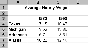
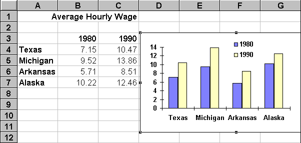
Our sample data, the 1980 and 1990 average hourly wages for production workers in four states, was obtained from the Statistical Abstract of the United States. This information was used to construct a five row and three column spreadsheet table.
Step 2
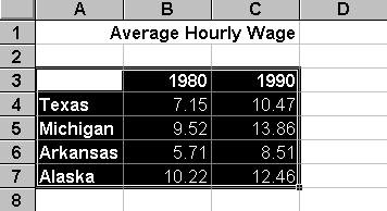
The data, including the row and column labels, was highlighted by (1) moving the mouse to cell A3, (2) pressing the mouse button, then (3) moving the mouse to cell C7 while still holding the button.
Step 3
As soon as the graph data is highlighted, we need to start Excel's Chart Wizard. There
are two ways to do this. The easiest way is to simply press ![]() on the Excel button bar. You can also
start the Chart Wizard by (1) selecting the Insert pull-down menu, (2) choosing Chart,
then (3) choosing the "On This Sheet" option.
on the Excel button bar. You can also
start the Chart Wizard by (1) selecting the Insert pull-down menu, (2) choosing Chart,
then (3) choosing the "On This Sheet" option.
Step 4
The next step causes the most frustration --- not because it is hard --- but because it is so easy to forget.
Regardless of whether you used the Chart Wizard button or the Insert pull-down menu, the next step is to highlight a rectangle on your spreadsheet for Excel to place the graph. Sadly, Excel does not prompt you to do this. Instead, it waits (and waits and waits) until you remember to do it.
It isn't necessary to be overly concerned about the exact size or location of the graph rectangle at this point. You can easily re-size and re-locate it after it is constructed.
For this example, highlight the D3:G11 region as the target location for our graph.
Step 5
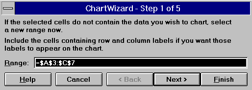
As soon as the target location for the graph is marked, Excel will display a sequence of five very logical dialog boxes. Excel makes a "best guess" selection for each dialog box. As soon as you review (or alter) the selections on one dialog box, press the Next button to advance to the next dialog box. You can press the Back button if you want to revise the selections made on an earlier dialog box.
The first dialog box allows you to verify (or alter) the location of the table of graph data. In this example, Excel displayed the range =$A$3:$C$7. This is the absolute address of the A3:C7 range that was highlighted in step 2. Since it is correct, we can simply press the Next button.
Occasionally, you will need to construct a graph from non-adjacent data. This first dialog box is handy for these cases. For instance, if our data was located in columns A, B and X instead of A, B and C, then we could type the range =A3:B7,X3:X7 on the first dialog box. That is, the comma can be used between non-adjacent rectangles of data.
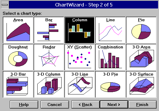
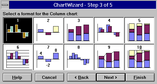
The second dialog box allows you to choose from fifteen broad categories of charts and graphs. For this example, the Column Bar chart should be highlighted before pressing the Next button.
Within each of the fifteen broad chart categories, there are many sub-categories. There are ten for the Column Bar chart. Highlight the first sub-category, then press the Next button.
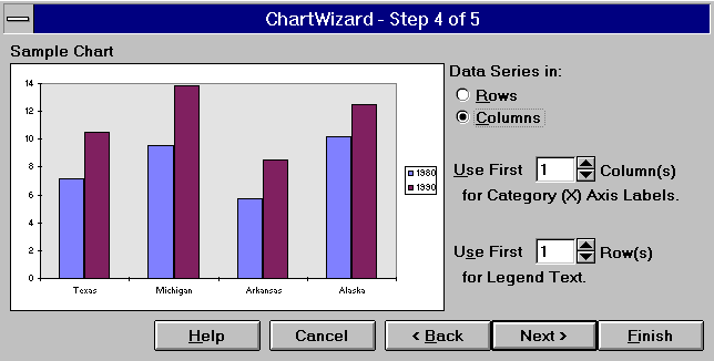
The fourth dialog box displays a thumbnail view of our graph. If it is not what we want, then we can press the Back button to revise our previous selections. This dialog box also allows us to indicate whether our data is organized in rows or columns, as well as indicate how many rows or column are used for labels.
The final Chart Wizard dialog box allows us to add a legend, title, and labels for the two axis.
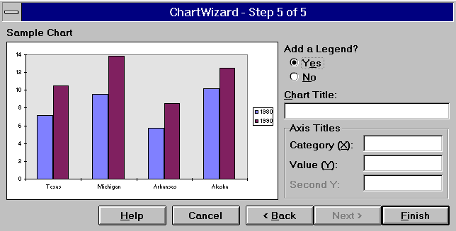
We press the Finish button as soon as we are satisfied with the graph.
Step 6
This bar chart is nice, but it isn't perfect. For instance, the state names are too long to be printed without wrapping.
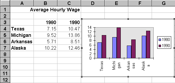
We can edit anything in an Excel graph by simply moving the cursor to the desired item, then double clicking the mouse button. Excel will lead us through a series of easy to use editing menus. In this example, a number of cosmetic changes were made:
- The gray background was removed.
- The legend was moved from the right side to the top center.
- The legend border was removed.
- The State names were aligned horizontally.
- The font for the legend and axis labels was made bold.
- The color of the 1990 bars was changed
From start to finish, it only took 52 seconds to construct and edit this graph.
Additional Excel Information
- Getting Started With Excel
- Menu Bar
- Button Bars
- Cell Ranges
- Relative & Absolute Addressing
- Drag Copying
- Function List
- Function Wizard
- Excel Example
![]() Home | Lectures
| Handouts | Assignments |
Home | Lectures
| Handouts | Assignments |
 This website was originally developed by John Mote for his MIS 311F class. This site is
now maintained by the Department of Civil Engineering
at the University of Memphis. Your comments and questions are welcomed.
This website was originally developed by John Mote for his MIS 311F class. This site is
now maintained by the Department of Civil Engineering
at the University of Memphis. Your comments and questions are welcomed.